Pages

Friday, February 28, 2014

Go Big or Go Home

Daughter-in-law Angie, who broke her fibula on black ice, last week while bike riding with the family, had given me an old stereo cabinet that the neighbors were tossing out. The cabinet had a glass front, removable shelves and no backing. I thought it had possibilities to become a portable linen cabinet. It took me almost a year to shove it from room to room, deciding what color to paint it. This was the original look:


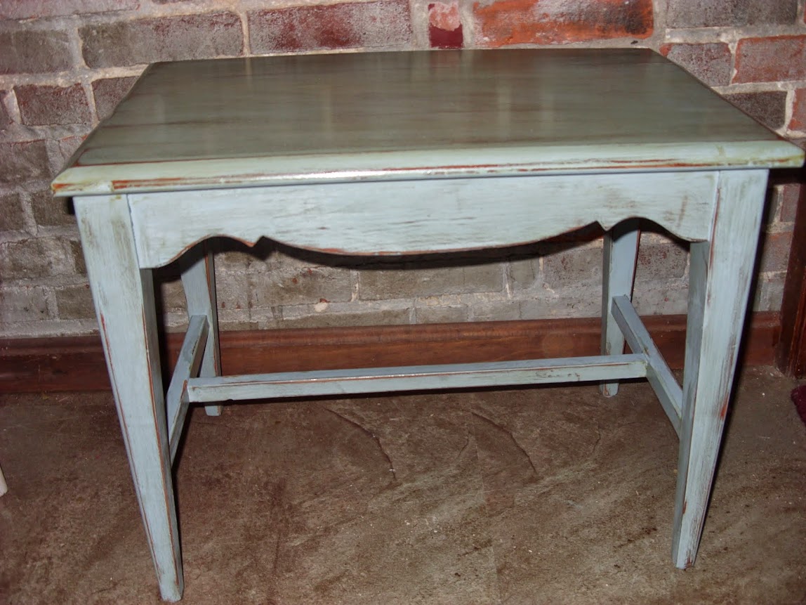
I knew the rich brown tone would be an advantage when distressing the piece.


A few years ago, I picked up several bundles of single beadboard for $6 at ReStore. The tongue and groove made the back easy to assemble. I gave it a quick stain so the interior would match the outside after I painted it. The color has no name as I was using a couple of combined Oops paints. 


A view of the finished inside.


After distressing.


After glazing.

THEN, I went off the reservation. I can say that and be politically correct, because I am like 1/32 Native American on my mother's side. That, and Irish. [You will be hearing from the Irish side soon] 

I had fully intended to etch the word LINENS, plus some opaque designs into the glass. I surely watched enough less than interesting You Tube videos on how to do it. A trip to the big box store did not produce the etching cream, and I did not feel like driving anywhere else in the ice, so back-tracked to a "4 the Love of Wood" blog I remembered where Kristy took an old cabinet and made new doors for it, painting the word APOTHECARY on the glass. It looks fabulous. Co-incidentally, she she re-posted that column this week. It can be seen here.  http://4theloveofwood.blogspot.ca/2012/06/not-just-any-word-will-do-how-to.html 


This is where the Go Big or Go Home bit comes in. I thought I could invoke some high school art classes and produce sort of a Van Gogh's Sunflowers Revisited. Pretty much a FAIL. Unless someone out there says, "Oh, that is just what I am looking for..." I painted the flowers from the inside, but had to paint them in reverse as to how they would be seen through the glass. That meant the seeds had to be painted first, and then layer on the rest. Finally, I painted over top of all the glass, so there would be no see-through parts.


A close-up.  


Plenty of space for towels and toilet paper.


I am not a matchy-matchy person, so I was going to "phone-a-friend" to borrow some nice ones, but decided to keep it real.


A finished photo (for now). I may still get my razor blade out and de-flower the cabinet. 
By the way, Angie survived the week up north with 'helpful' relative visits, and will be going back home to C'bus with the kidlets and her crutches awaiting news of healing progress. I soooo have empathy for her.
 (no bathroom on the first floor)!

As for the cabinet, I tried to Go Big, but in retrospect,  I should have just Gone Home.

Linked to Miss Mustard Seed's Furniture Feature Friday.

POST SCRIPT: This piece is now PLAIN.

~.~.~.~.~

I will post about my Irish pins in the next day or two. Can mail out of state in time for St. Paddy's Day.

As ever,
La Verne
hope&salvage

Thursday, February 13, 2014

Blue Bayou


******Warning: This post is PICTURE HEAVY******

Whenever I think of Blue Bayou, I think of my husband and Crystal Gayle. I'm sure they never met, but he was crazy about her voice. He would sing her songs over and over. And over. One time he was at a lady's house all day installing a bathroom, singing aloud as though no one else was near. The lady finally stopped him and said, "You are by far the happiest plumber I have ever met, but do you know any other songs?"

I've never really been a "blue" person. If someone asked what my favorite color was, the answer would be "red", "green", "black", "brown", but never blue. However, this past year, in deciding colors to paint furniture, I usually resort to shades of blues. I don't know why.

Back when I was a quilter, before the house fire, when I had hundreds of yards of fabric stacked on several bookcases and in bins, I would group fabrics by shades, tones and colors by the hour. Every Quilter's Newsletter and Quiltmaker would be open or bookmarked, or rubber-banded to a series of fabrics intended for a quilt. Hardly any were blue. Michael James, the dominant male quilter on the scene in the 70's and 80's, had made a statement about color that always stuck in my head. Paraphrasing, he said that fabric manufacturers had a 7 year rotation on colors so at the end of that cycle, the buying public was so 'starved' for a certain color that had been absent from the landscape, that they would immediately go out and BUY it.I started paying attention to see how true that was. One year the trend would be jewel tones and the next would be red, white and blue. Then, on to pastels, primary colors, then neons. He was right.

A little more than a year ago, when I realized that I could 'paint' a piece of furniture without Deus ex Machina coming down from the sky and punishing me by removing my arms, I started to think again about color and choices that were trending in contrast to stained and varnished furniture. In the past, furniture always meant a shade of BROWN to me. But, I have come to realize that most of the pieces I paint are BLUE! I bet that blew right by you.... Here are some of my samples:

         
Donated to a fundraiser for friends, Kat & Stevan's IVF.


Donated to fundraiser for B Fab Relay for Life (Brunswick) in honor of daughter-in-law, Jen's Mom.


                                                Checkerboard Table in progress                                                                   Well, "don't that make my brown eyes blue"..... [Actually, they're hazel.]

As ever,
La Verne
hope&salvage